Cartoon Network
Team
Neha - Lead Motion and Production Designer
Matt Emond - Lead Visual Designer
Seneca Brandi - Lead Interaction Designer
Turner and its International Cartoon Network brand sought to expand and enhance its existing video streaming app across multiple platforms, including mobile and TV devices. The goal was to increase user engagement and Annual Recurring Revenue (ARR) by providing a consistent, intuitive experience across different screen sizes and devices.
Goals
Port to Multiple Platforms: Successfully port the existing mobile app to TVOS, Fire TV, and Tizen for a consistent experience across devices.
Improve User Experience: Enhance the onboarding process and simplify app navigation, ensuring the design was fluid, engaging, and easy to use on both mobile and TV.
Make it Fun: Use motion design to elevate the interactions, making the experience more engaging without overwhelming the user.
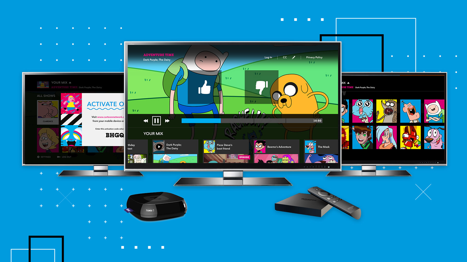
A key opportunity in this redesign was solving the Onboarding and Mix-Generation challenge for Cartoon Network’s OTT app.
The Challenge and Opportunity
The main challenge revolved around the Mix-Generation feature, which allows users to personalize their content by selecting favorite shows. While central to the app's value, it wasn’t being used effectively. Many users didn’t understand how their content mix was created or how to personalize it. Some were unaware they needed to actively select shows, while others found the process frustrating. The issue wasn’t about adding new features but about communicating the value of personalization and making it easy and engaging.
This challenge presented a significant opportunity to design a solution that addressed user confusion and improved engagement from the very first interaction with the app. The solution needed to do more than improve the flow—it had to rethink how users interacted with the app, starting with an onboarding experience that both informed and captivated users.
My Approach
As the Lead Motion UX Designer, my role was to
Lead the creative direction to enhance the user experience.
Introduce motion design to make the onboarding process not only functional but interactive and enjoyable.
The primary goal was to make the process of selecting favorite shows intuitive and clear, using motion design to guide users through the steps in a way that felt playful and on-brand with Cartoon Network’s personality
1. Understanding the Problem
The first step was getting a solid grasp of the challenge. I conducted research on the existing onboarding flow. The key takeaway was that users didn’t immediately realize they had to select their favorite shows to personalize their content mix. Without this understanding, they struggled to make the most out of the app.
To dive deeper into the issue, I also conducted internal discussions with product owners and the client’s design team, aligning on their goals for the app. The main concern was ensuring the onboarding process didn’t feel intrusive but instead felt like a fun, essential part of the app experience.
2. Designing the Solution
Armed with these insights, I began sketching a new approach that would communicate the concept of Mix-Generation in a clear and engaging way. The solution had to be intuitive, incorporating visual cues to guide the user’s attention and create excitement around personalizing their content.
We decided to leverage motion design as a key tool to capture attention and make the onboarding experience more interactive. Here’s how I approached the design:
Interactive Visuals: Instead of a static screen, I proposed a dynamic, animated experience that guided users through the process of selecting their favorite shows. The animations provided clear cues about how the app would personalize their experience, helping users understand the “why” and “how” behind the action.
Playful and On-Brand: I made sure the design kept the fun and vibrant aesthetic that Cartoon Network is known for. The animations were lively, but not overwhelming. It was important to maintain the app’s playful character without detracting from usability.
Clear, Step-by-Step Flow: The animation introduced a step-by-step process, where users could see exactly how their selections influenced the content they would see in the app. For example, after a user chose a favorite show, the animation would show the app pulling that choice into the personalized content feed. This clear cause-and-effect process helped demystify the personalization feature.
3. Collaboration with the Client and Developers
After finalizing the design, I presented the motion concept to the client. They were thrilled with the approach, as it not only solved the usability issue but also aligned with the brand's playful tone.
Once we had client approval, I collaborated closely with the development team to ensure that the designs were technically feasible and optimized for all platforms, especially the TV experience. Since the Mix-Generation feature had to be consistent across mobile and TV, I worked with developers to balance motion design with platform-specific performance. For TV devices like Tizen, we had to consider performance limitations to prevent the animations from affecting app fluidity.
During this phase, I also worked with testers to ensure that the new onboarding process was smooth and intuitive across multiple devices.
4. Testing and Iteration
Once the design was implemented, we conducted user testing again, this time focusing on the revised onboarding process. The response was overwhelmingly positive. Users immediately understood how their content mix was generated and enjoyed the interactive animations that guided them through the process.
We fine-tuned the experience based on feedback, making small adjustments to the animations and flow to ensure the transition between screens was seamless. We also ensured that the process was quick and effortless, avoiding any unnecessary steps that could frustrate users.
The Result
The Mix-Generation feature became a highlight of the app, with users now fully understanding and engaging with the onboarding process. The redesigned experience provided the clarity and excitement that users needed to personalize their content without confusion.
Increased Engagement: Users were more likely to engage with the app and complete the onboarding steps, resulting in better personalization and more tailored content.
Seamless Experience: The animation provided an engaging, fluid experience from the moment users opened the app, reinforcing Cartoon Network’s brand identity while making the process intuitive.
Cross-Platform Consistency: The new onboarding flow worked seamlessly across both mobile and TV platforms, ensuring that the experience felt consistent whether the user was watching on their phone, tablet, or TV.
Final Thoughts
This project was an excellent example of how thoughtful design, combined with the right use of motion graphics, can transform an app experience. By focusing on clear communication and engaging interactions, we were able to solve a critical pain point for the client—improving the Mix-Generation onboarding process—and enhance user satisfaction.
By bringing together brand goals, user feedback, and technical considerations, we created a fun, interactive, and intuitive experience that not only solved the initial challenge but also improved overall user engagement across platforms.
For me, the takeaway was clear: understanding user needs, collaborating closely with the team, and using motion design effectively can turn a complex process into an enjoyable experience that drives higher user engagement and satisfaction.
Responsibilities
My responsibilities the lead Motion Ux Designer were-
Work with internal and client design teams to understand product vision and direction.
Collaborate with product owners and project managers in an agile environment.
Create front end UI files (in After Effects)
Work 1 on 1 with developers and testers to implement the UI design files.
Enhancing user experience by adding motion graphics to interactions.
Conduct regular UX review with project management and clients to ensure highest quality.
Focus - Improve Onboarding process
One of the key feature of this app is ability to personalize their mix . This gets configured at different place throughout the app, the more significant being right after app launch for the 1st time.
Research Findings
Participants did not know, how videos are populated in their app Mix
Participants failed to recognize that they are being asked to select a favorite show and immediately tap ‘Start Watching’
Solution
Explore a better way to communicate Mix-Generation - We decided to use Motion Design to capture the audience’s attention while adding an exciting interactive aspect to it. Here are the storyboards and mock up videos I created to convey our ideas for client approval.
Challenges
Technical
The 3D animations utilized high memory on low end hardware (Tizen TV) interrupting a fluid experience. We revisited the onboarding experience to find reasonable alternatives, while still not compromising the user experience.
I managed these change requests with alternate solutions while w validating them with developers to incur minimum tech debt.
During the last phase of the project , I worked on site with the client to ensure any last minute pre release challenges.
Motion Design
Designing motion for a large 10 ft interface in a way that portrays the character of the brand while not being too loud.
Finding opportunities to add the 3rd dimension to the flat interface design.
Final Product
The application was a huge success with the audience due to it’s bold and vibrant appeal, paired with ease of navigation and discovery. A week Into the beta release , we got some performance related feedback form users, which was fixed in subsequent releases.
Here are a few highlights from the application-


Support
After the project delivery, I on-boarded the client design team by organizing training workshops and offering technical support for a period of 2 months after training until they were confident with our technology.
Takeaway
Consider technical requirements and limitations of all platforms to create a robust app design.
Keep linear and simple navigations
Avoiding any jarring animations, and hence keeping the motion design subtle and minimal.
Minimize interactions to avoid reaching out for the remote control often. Most of the times it takes more time to find that missing remote, right?